
A call to action, or CTA, is the part of a website, ad or email designed to prompt an immediate response from your audience and encourage them to take a specific action.
The dos and don’ts for writing a good call to action may seem straightforward, but even today, the hyperlinked words “Click here” are the overly simple, non-descriptive CTA of choice for many company websites. But don’t resign yourself to the dreaded “Click here”! Here’s our list of tips for writing a quality CTA.
Consider usability
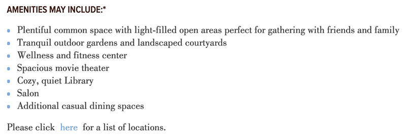
People are more likely to use your website if they know what to expect, and “Click here” doesn’t tell the user anything about the end result. In addition, the phrase “Click here” is often too small for users to effectively click on, especially on mobile (just using “Here” is even worse). As a generic phrase, it gets lost easily among text, images, and video. It’s particularly bad for assistive technologies like screen readers, which can’t use visual context clues to help the user navigate:
Use active CTAs
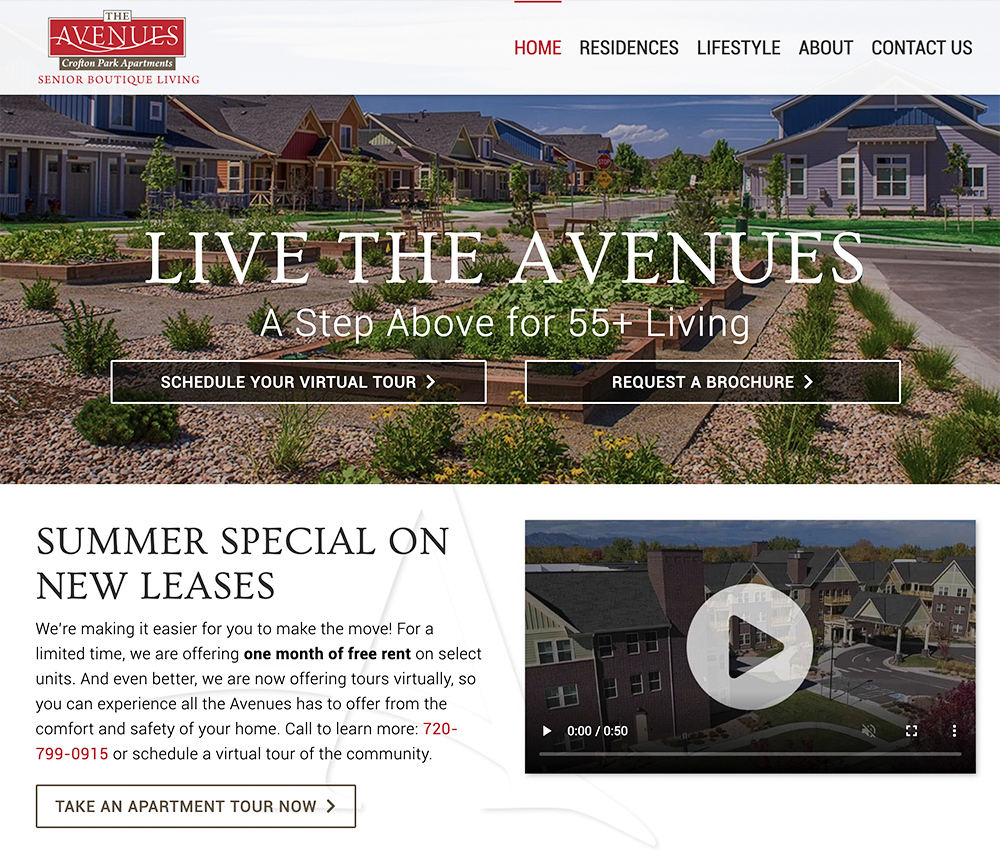
Your CTA should start with a verb, one that is assertive and tells your user what action to take. “Learn more” is a good, reliable CTA because users know they will be taken to a page that contains more detailed information about your product or service. “Schedule a tour” tells the user exactly what to do and what they’ll get as a result. It’s an active CTA that keeps their attention. These descriptive CTAs from The Avenues Crofton Park, a senior living community in Broomfield, Colorado, all use strong, active language:
Be clear
The internet can be frustrating to navigate and is always changing, so one of the core principles of web usability is “don’t make me think.” Just a little hesitation can be enough to lose your visitor. Being clear in your CTA also helps people understand where they are. Within five seconds of landing on your site, a user should be able to answer these four questions:
- Whose site is this?
- What does this company do?
- What can I do on this site?
- Where do I go next?
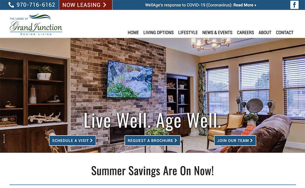
For example, on The Lodge at Grand Junction’s website, the CTAs “Now Leasing” and “Schedule a Visit” communicate the availability of apartments for lease.
Pick your location
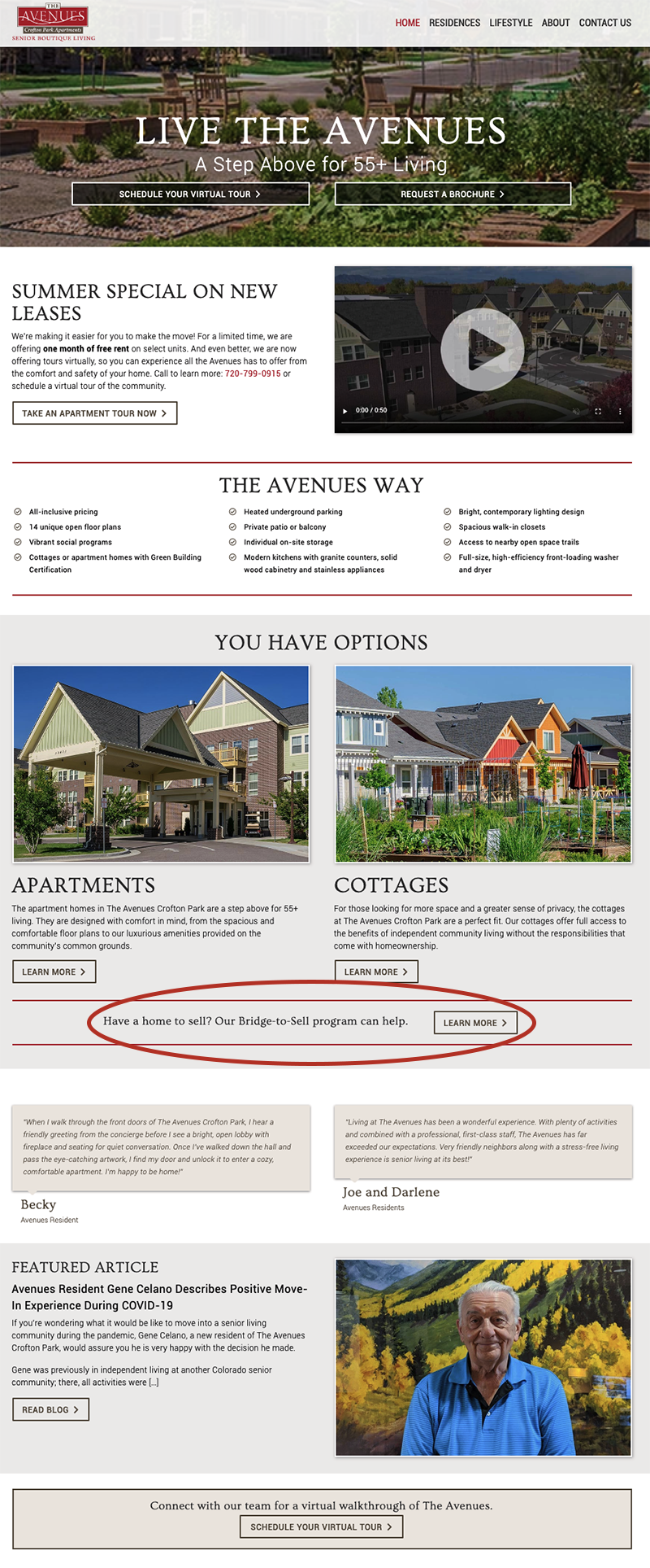
A CTA’s placement is key. Users should be able to see a CTA no matter where they are on the site, whether it’s your phone number, email address or a “Contact Us” button. In addition, a strong CTA at the bottom of the page will catch users further along on their buyer’s journey. If they have already read all that way, don’t lose them! Users who aren’t ready to sign a rental agreement just yet are more likely to respond to a “softer” CTA higher on the page, like The Avenues did with this link to their Bridge-to-Sell program.
And, don’t be afraid to test the location of your CTAs on a page. You can measure what is working by setting up “goals” in Google Analytics for CTA links, and you can also use heat mapping to see how your visitors are engaging with your website.
If you need help bolstering your website, ads or emails with effective CTAs, we can help. Contact us online or call us at 303.499.9291.